Stroll

Visual Design

Branding Vision

The name

The name, Stroll, that amongst many other names that we were pondering about, was one that truly captured the spirit behind the app and the experience we wanted to create for our users.

Stroll embodies the idea of walking together with someone you genuinely like to prolong the evening that you have spent together. When you stroll with someone, the conversations flow more authentic and unfiltered compared to a formal dinner date. It brings about a relaxed and genuine connection, where pretences are shed, and meaningful exchanges take place.

In the realm of Stroll, connections unfold - genuine conversations, stories untold. For in Stroll, we facilitate finding a unique bond between the curious, the interesting people, the ones who crave a connection beyond the surface.

How the app is meant to feel

Stroll is designed to embrace the tranquil essence of the nighttime, creating a soothing atmosphere where you can unwind and connect deeply.

Stroll is the app you use as the day draws to a close and you find solace in the comfort of your room. Nights have a unique magic, where conversations flow more effortlessly, unburdened by distractions.

day

night

In our pursuit to recreate the online dating space, we strive to shift the focus from quantity to quality interactions, and to foster an app culture that celebrates everyone’s beauty and quirks. Stroll is not an app that is entirely meant for serious deep things, it’s a place where laughter mingles with vulnerability, where you can explore the depths of someone's passions and dreams, as well as random thoughts.

Branding Strategy

Tone

Stroll’s branding strategy revolves around creating a personal and relatable experience for users, where the tone of copywriting aims to make users feel like their best friend is chatting with them. With a tone that is witty, playful, and light-hearted, we infuse our brand with a sense of humour and authenticity.
Culture Walkthrough
Culture Walkthrough
Onboarding
Onboarding
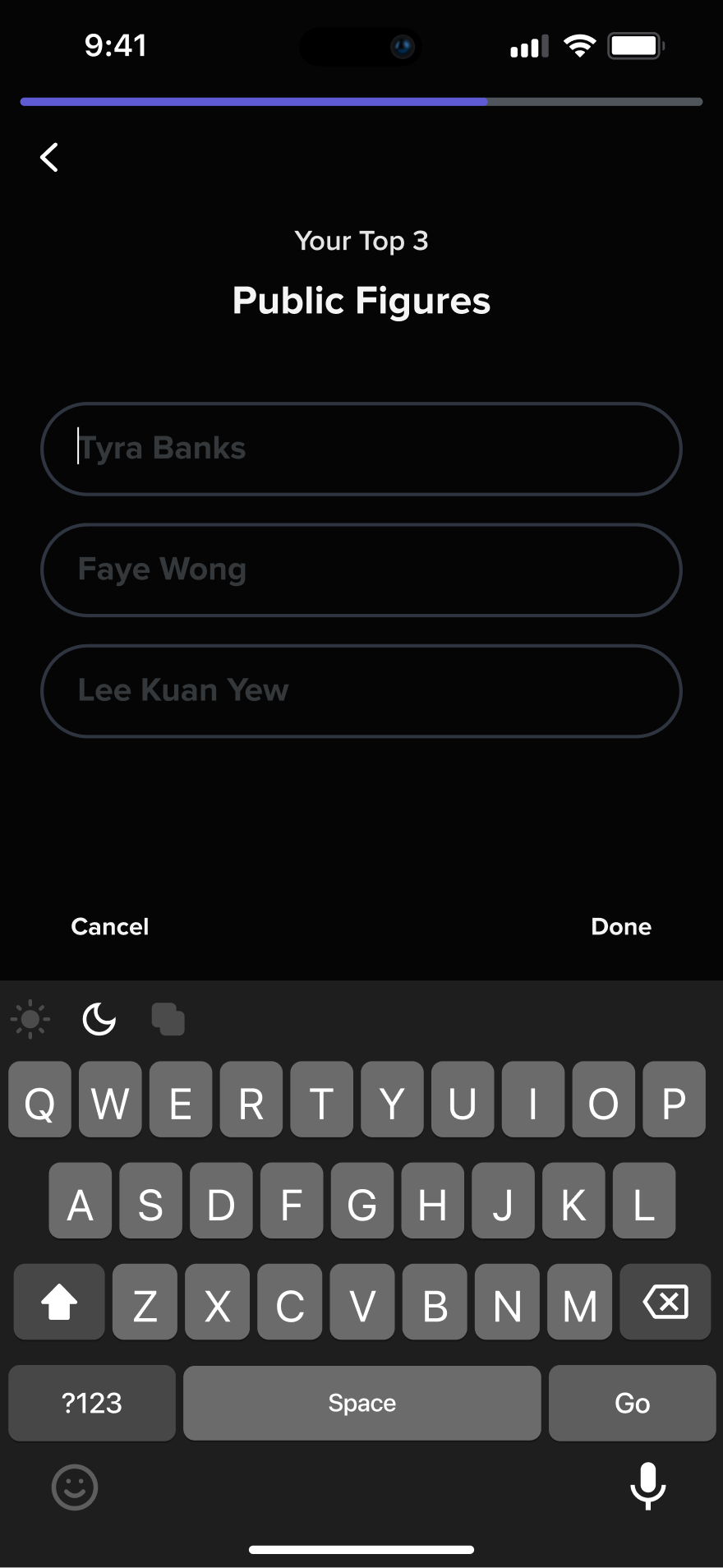
We place a huge emphasis on localising the app copywriting to match the unique cultural nuances and demographic of each country we operate in. This ensures that the app feels familiar and relatable to our users, while breaking away from the mundanity of the typical dating app user journey.
Onboarding Journey reflecting different placeholder text depending on the user's demographic
Female, 18-26 y/o
Female, 18-26 y/o
Female, 18-26 y/o
Female, 18-26 y/o

Colours

The choice of colours for our app design aims to create a unique and immersive experience. The dark app base, reminiscent of a nighttime setting, provides a soothing and comfortable environment for the users, especially during evening use. The contrasting colour, purple, was used to add a touch of liveliness and excitement, while still maintaining a soothing ambience in the app.
background-base
#050506
purple-1
#5F5BD5
purple-2
#B5B2FF
The combination of the dark base and energising purple accents creates an atmosphere that ensures our users feel both relaxed and invigorated while using the app.

Graphic Style

In our app’s graphic style, we have embraced a distinct art direction to set ourselves apart from the crowd. We have intentionally chosen to use digital drawings and real-life videos shot in localised environments, steering clear of the commonly seen illustrations and stock footage used by most apps.
Creative Brief
Bringing the concept to life
Completed drawings for the app graphics
The artistic elements that we want to portray goes beyond what can be achieved with illustrations or stock footage, allowing us to create or capture genuine emotions or dreams of connections that resonate with our users. The level of attention to detail aims to enhance the overall user experience, fostering a sense of trust, intimacy and connection within our app.